![]() Technical Notes on the prints (#13 ~ #18)
Technical Notes on the prints (#13 ~ #18)
![]()
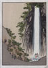
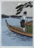
Print #13: Fudo Waterfall, by Ando Hiroshige
As I mentioned in the story, most of the designs in this Hiroshige set really are pretty bad. The prints themselves are made well - nicely carved and printed - but whoever designed them sure didn't spend much time on the job. This one isn't too bad, though ...
Not sure if I should write about this or not ... but ... When I was doing the print run of this one, I had done a half-dozen impressions of the skin tone block before I noticed something; it seems I had cut the shape for his body just a little bit on the large side, and there was a small dab of pinkish pigment just peeking out from below his loincloth. I realized that this might lead people who were looking at the print very closely to perhaps see something there that wasn't particularly intended ... (!) So I re-touched the block at that point to remove the wood, and keep the print 'safe' for all viewers!
But I didn't remember this when I was checking over the prints for signing and sealing, so I guess that those 6 or 7 prints have now 'escaped' into the wild ... Did you get one? :-)
Blocks: 7 cherrywood
Printing impressions: 9
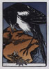
Print #14: Magpie and Insect, by Jules Chadel
Even before sending this one out, I know what sort of reaction I will get from the collectors. For the most part, western collectors will be happy with this one - it has 'character' (to put it mildly!), but many of the Japanese collectors will roll their eyes ... "There goes Dave again ..." This bird isn't a crow, but it's close enough - an evil-looking large black bird - and as such is not the sort of thing that people want to see in a collection like this.
But what can I say ... I really don't want to stick with just 'safe' topics, and I don't really think this is all that 'bad' ... :-)
Blocks: 7 cherrywood
Printing impressions: 8
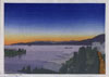
Print #15: Canadian Sunset
Here's a rundown of the basic steps I went through to make this print:
- scanned the basic image into Photoshop
- masked out the sky, then posterized the rest, trying various parameters to break the sea into the levels you see in the print
- put the sky back in, printed a 'master' copy on my inkjet, and drew in registration marks
- took that to Kinko's and ran off a dozen mirror-image copies onto special paper I prepare myself (extremely thin gampi laid onto normal copy paper)
- lifted the gampi sheets off the backing, and pasted them face up onto blank woodblocks
- at this point, all the blocks/images were identical; I started carving, keeping mental track of which block would be used for which area in the finished print ...
- once the set was ready - ran a half-dozen proof copies, trying out various levels of pigment application.
- deadline approaching - so paper wet, and get printing on the 200 copies of the edition, referring to the proofs for rough guidance ...
- ship it!
Blocks: 11 cherrywood
Printing impressions: 14
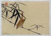
Print #16: Bird and Bamboo
I'm not exactly sure what kind of bird this is supposed to represent. The Meiji-era print that I worked from had some vague green colour kind of smeared over the breast, but I really didn't like that very much, so I took a free hand and changed it to the tone you see here. I certainly didn't refer to any reference books or bird identification illustrations ... it is completely imaginary. So I suppose it's quite possible I'll get emails suggesting that this yellow/brown tone is not realistic for 'such-and-such' a bird ...
Blocks: 10 cherrywood
Printing impressions: 11
Print #17: Autumn Moon, by Hiroshige
I mentioned in the main story for this print that I own a few different versions, including a couple of postcard editions. One of those is a bit interesting; after the 'normal' printing was done, the printer did one more impression, of a beta-ban - a blank block covering the entire image - using a quite dark pigment, which plunged the scene into a most gloomy mood. I actually prefer that version, but I didn't dare try it for this Treasure Chest edition ... I was just too afraid that the collectors would find it dark and depressing.
But in retrospect, I wonder that this one is just too pale and boring ...
Blocks: 7 cherrywood
Printing impressions: 8
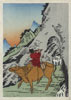
Print #18: Riding the Ox Home, by Hokusai
This is actually only half of the design that Hokusai created: in the original book the print continues off to the left, where we see more mountains, and on the continuation of the pathway, a man is climbing up towards us ...
Blocks: 7 cherrywood
Printing impressions: 10
|
Treasure Chest Front Page | Introduction | The 24 Prints | Subscriptions |
|
All material Copyright © 2004~5 David Bull |
|
Contact: David Bull |