![]() Technical Notes on the prints (#7 ~ #12)
Technical Notes on the prints (#7 ~ #12)
![]()
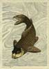
Print #7: Swimming Carp, based on a design by Hokusai (?)
This is perhaps the easiest print in the set so far, and it posed no particular technical challenges.
To get the marbled background effect, I didn't actually do any marbling. Using this sort of effect was not uncommon in Edo-era prints, and I simply took one of those and traced appropriate sections of it, and then cut the block to match.
When I was doing the test printing I tried leaving the background pattern in karazuri (embossing), with no pigment, but although it looked kind of nice, the carp was just left too bare, so I used the light tone you see.
Blocks: 6 cherrywood
Printing impressions: 7
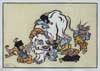
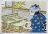
Print #8: Elephant Fable, by Hanabusa Itcho
This one too is a pretty straightforward job - at least in the printing; there are no gradations or other special techniques.
The carving though, offered a bit more of a challenge. With faces this small, getting the details correct demands an extremely delicate touch with the knife. Even the tiniest fraction of a millimetre variation in a line or curve on a face can dramatically alter the person's expression.
Not that that matters on this print!
Blocks: 8 cherrywood
Printing impressions: 8
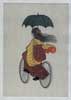
Print #9: Girl on Bicycle, from a design by Chikanobu
This was printed on the same block set as the previous print, so shares a common background tone. But the key block for the two prints was 'inked' with two brushes; I wanted a dark black for the elephant print, but a lighter and softer greyish black for this one.
I also had to consider putting some kind of gradation at the lower end of the background tone, to give her a 'ground' to be riding on, but after doing a couple of tests that way, I decided to go with the 'floating in space' appearance you see ...
Blocks: 8 cherrywood
Printing impressions: 9
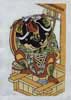
Print #10: Kabuki Actor, by Nishimura Shigenobu
It doesn't really have the same kind of attractiveness as the original one I have here, but perhaps after this one too has aged for that long, it might develop a similar patina ...
After finishing this one, I had a bit of a re-think, and regret not putting a background tone around the actor. It would have given the white cloth areas even more contrast than they have. But isn't it interesting that the white of the cloth, and the white of the background, look different, even though they are both the same untouched paper!
Blocks: 6 cherrywood
Printing impressions: 8
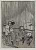
Print #11: Rainy Season, by Katsushika Hokusai
Not really too much to say about this one ... I certainly had to make sure I had a good strong piece of wood, because this is carved at just about 1/2 size of the original, and I didn't leave out a single line!
I wasn't quite sure how to cut the three 'colour' blocks; this image is reproduced in a number of the reference books I have here, and in every one the grey tones are completely different. It's completely impossible to determine what the intentions of the team who made the original version were, so I just looked the various versions over, and cut a set of blocks that matched what I thought was a reasonable interpretation ....
Blocks: 4 cherrywood
Printing impressions: 4
Print #12: The Weaver, by Ogata Gekko
Although not visible in the final print, there is something a bit special about this one - the key block is carved entirely on boxwood. With the fifth print in the set - Benzaiten - I inserted a 'plug' into the keyblock for the face, but for this one, the fine lines everywhere 'asked' for boxwood instead of the usual cherry ... and they got their request!
Another challenge was trying to 'balance' the tone of the three totally different blues in the print. We never saw that sort of thing in Edo prints, but by this period - mid/late Meiji - printers had access to a much wider range of pigments. I imagine the effect must have been very dramatic and 'new' to the viewers of the day ...
Blocks: 8 cherrywood, 1 boxwood
Printing impressions: 13
|
Treasure Chest Front Page | Introduction | The 24 Prints | Subscriptions |
|
All material Copyright © 2004~5 David Bull |
|
Contact: David Bull |